
Keep · Fintech · Mobile 0→1 · 2026
A fast way into Keep for cardholders on the go
Timeline
4 weeks scoping & design
2.5 months build
launched Jul 2026
Team
1 designer (me)
2 engineers
Senior PM support data
1 creative designer
Role
Product designer &
acting product owner
Platform
iOS · Android
(React Native)
Problem
Keep was built for the desktop. However, 36% of Keep’s daily users were already on mobile, stuck behind a slow, mobile web experience with 2FA every time.
What I did
I made the business case from NPS data, scoped the MVP as acting product owner, designed the app end to end, and co-led the launch.
25%
of businesses had a user on the app in month 1
~30%
of adopters use the app daily
544
installs in the first 2 months
48%
of installs came from in-product nudges
Context
Keep was built for the desktop
Keep is an all-in-one business banking platform for Canadian small businesses: business credit cards, multi-currency accounts, capital, rewards and expense management.
For years it was web-first. On a phone, customers got a squeezed version of the web app.

Problem
Login was the bottleneck, and a third of users were already on mobile.
I led Keep’s NPS benchmark (Aug–Sep 2025). Login came up as the third most common thing to improve: 2FA on every login, short timeouts, and requests for an app with Face ID.
Usage data backed it up: 36% of daily users were already on mobile web.
“Do you have plans to create an app? The login procedure could be improved using Face ID.”
Keep customer, NPS survey
Hypothesis
If cardholders can reach their cards, balances and transactions in seconds, without repeating the web login and 2FA, they’ll check in with Keep and spend more often.
Scope
The core features every role shares
Finding the shared core
The web app served owners, admins, accountants and employees, each with different access. I mapped 16 modules against every role. The core was shared by everyone: the cardholder’s cards and transactions, so I proposed a cardholder-first v1 that serves every role from day one.

Two bridges for what couldn’t make v1
Leadership pushed Add to Wallet into v1 to lift card activation. Then we learned Apple’s approval would take about four weeks, so it came back out. Biometric login was deferred too due to timeline. Rather than drop the user need, I shipped two bridges.

Keep me signed in for 30 days
Fast access without biometrics: no login and 2FA on every open.

Design
Key design decisions I made
Navigation pattern
The MVP is pretty simple. Only three things mattered: cards, transactions, and a credit summary for admins. I explored three layouts before committing to one.
Option 1 · Two tabs
Simple, but admins would need a third tab, and “Transactions” is ambiguous next to banking.
Welcome, Karen!
My cards
All

Physical •••• 4893
$6,759.50 available
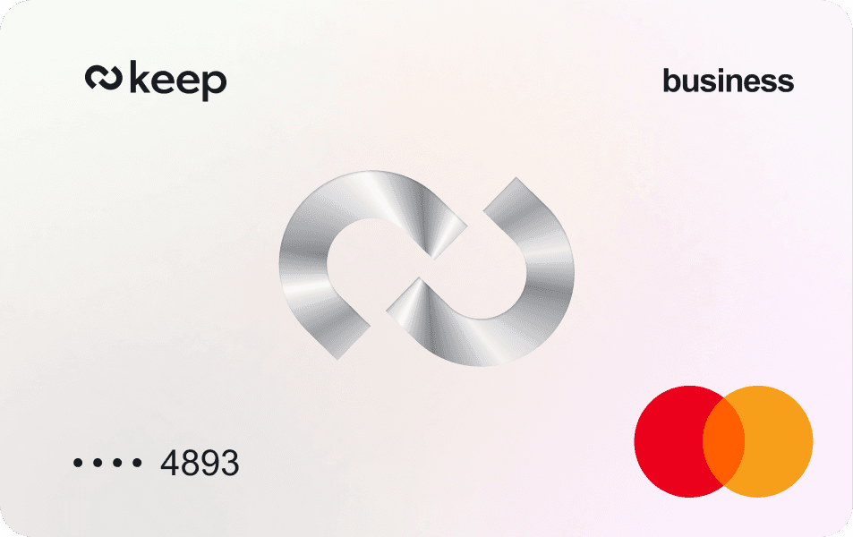
Virtual •••• 4893
$1,887.82 available
Recent activity
All
Across all cards
Today
B
Blue Bottle Coffee
Physical
••••
4893
·
9:14 AM
−$6.75
U
Uber
Virtual
••••
4893
·
8:02 AM
−$18.40
Yesterday
W
Whole Foods Market
Physical
••••
4893
·
7:45 PM
−$84.32
keep
Home
Transactions
Option 2 · Home + Cards ✅
One glance at cards and latest spend. Same tab bar for every role.
Option 3 · Card carousel
Hides activity across cards and breaks down with many cards.
Why did I choose option 2. Home + Cards?
Matches the job
One screen answers “what’s my balance, what did I just spend?”
One tab bar for every role
Admins get a credit summary section instead of an extra tab.
The data fit a snapshot
Most cardholders have about two cards (median 2), so Home shows them all.
One app, two roles
The same two tabs work for an employee and an owner. Only Home changes: employees see their cards and recent activity, admins see the business’s credit summary first.

Owner

Employee
Visual style: let the numbers speak
My first visual direction used tonal layers: grey backgrounds and white cards. For an app that’s mostly numbers, it felt heavy. The final style is flat and quiet, with white space, minimal containers and icon-only tabs.


Moving fast
PRD written with Claude
I brought the template and features. Claude drafted 30+ user stories, and we refined them together.
Themed, not built from scratch
A gluestack React Native kit, retokened to Keep’s brand with Claude and the Figma MCP.
Beta
Session replays from ~200 businesses drove two fixes
We opened a beta to about 200 businesses on June 30. Watching session replays, I found two patterns.
What we saw 👀
People kept scrolling transaction list, looking for more transactions.
What changed 📝
Infinite scroll instead of three rows and a “View all” button.

Before

After
What we saw 👀
People didn’t realize they’d reached the end of the list.
What changed 📝
An end-of-list label.

Before

After
Launch & impact
In-product nudges beat the launch email
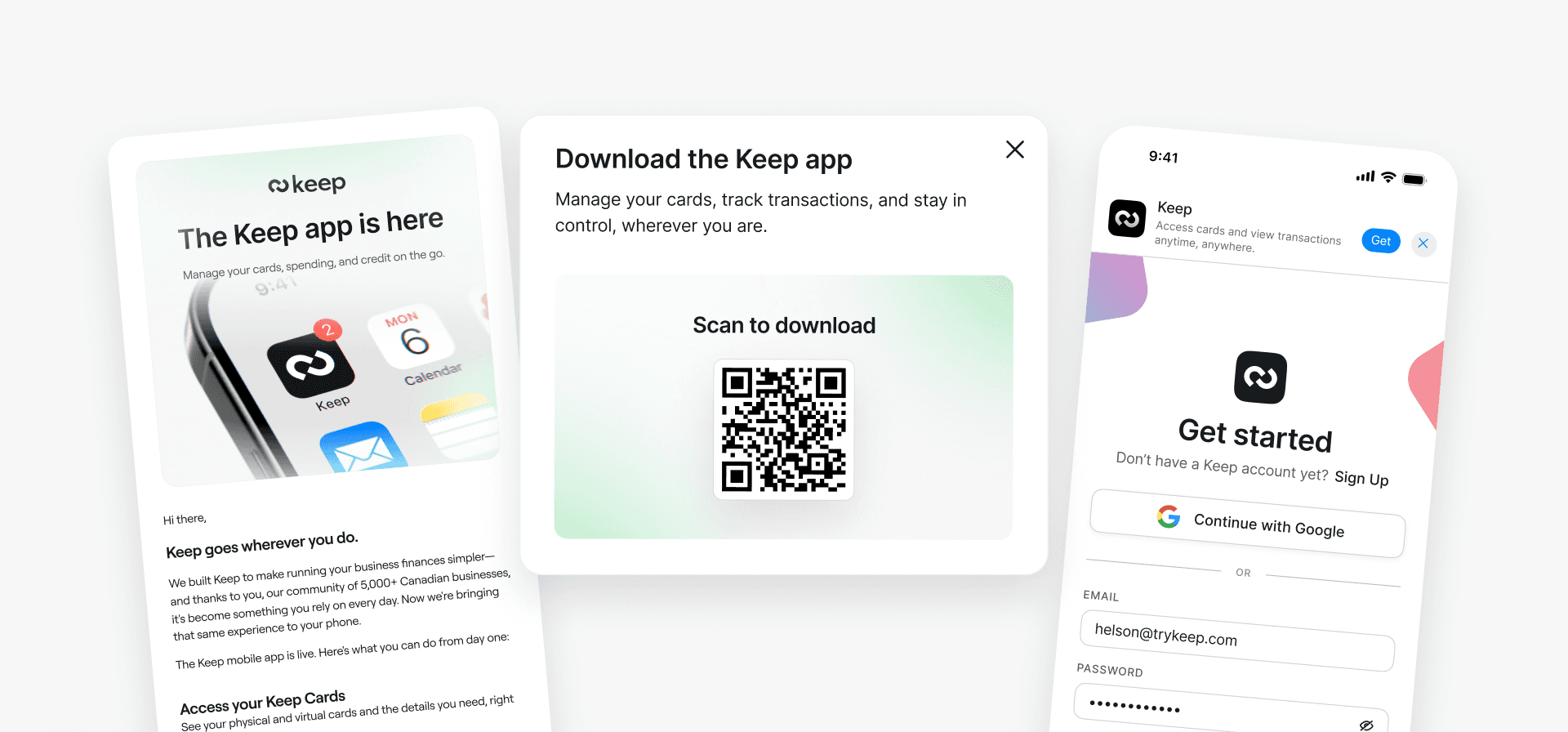
We launched on the App Store and Google Play in July 2026, with nudges where users already were: a QR modal on the web dashboard, a banner on the mobile-web login, and a launch email.

Reflection
What I’d do differently
Design navigation for what exists
I kept Transactions out of the tab bar partly to make room for future modules. The beta showed the cost. Today I’d ship a clear “Card transactions” tab and rename it when banking arrives.
Prototype instead of sketching
With today’s AI tools, I’d skip the paper wireframes and share a clickable, unstyled prototype from day one.
This is the short version.
I’m happy to walk through the full case study: the scoping trade-offs, the stakeholder pushback, and the metrics.